
What is the Bar Graph PTE Describe Image Task?
Among the many tasks that make up the PTE Speaking section, Describe Image is often seen as a tricky blend of observation and articulation. One of the most common visuals presented here is the bar graph, designed to test not just your English fluency but also your ability to interpret data clearly and communicate it with purpose. In this task, candidates are shown a bar graph and expected to describe its key features within a tightly timed format, making clarity and conciseness crucial.
The structure is standard but demands sharp focus. You will be given 25 seconds to analyse the image and mentally plan your response. Once that ends, the microphone activates and you get 40 seconds to speak. That’s not much time to ramble—so precision matters. The scoring is based on three main criteria: Content, Oral Fluency and Pronunciation—each contributing to your final speaking score.
Here’s a quick overview of the task format:
| Component | Details |
|---|---|
| Task Type | Describe Image – Bar Graph |
| Preparation Time | 25 Seconds |
| Speaking Time | 40 Seconds |
| Scoring Areas | Content, Oral Fluency, Pronunciation |
The bar graph PTE task is more than just describing what’s in front of you—it’s about communicating trends, comparisons and insights in a fluent, structured manner that aligns with how native speakers naturally speak.
How is the Bar Graph PTE Task Scored?
- Content: Examiners listen for relevance. Are you describing the graph’s actual data points, trends or relationships? A high score comes from covering the key features accurately without going off-topic or fabricating details.
- Oral Fluency: This isn’t about having an accent—it’s about rhythm. Smooth delivery, logical pacing and minimal hesitation all signal fluency. Fillers, unnatural pauses or self-corrections lower your score.
- Pronunciation: Clarity is key. Words should be easy to understand to both native and non-native listeners. While slight regional accents are acceptable, mispronunciations or slurred speech can cost you points.
Types of Bar Graphs in PTE
In the bar graph PTE task, not all graphs are created equal. While the core skill—describing data—remains the same, the type of bar graph you’re presented with can slightly change how you approach the task. Each variation brings its own layout, focus and visual cue. Being able to quickly identify the type helps you adapt your response with more ease and structure.
- Vertical Bar Graphs: These are the most common. Data is represented as upright bars rising from a horizontal axis. It’s ideal to talk about “increase,” “peak,” “lowest point” and so on.
- Horizontal Bar Graphs: The bars stretch from left to right. These often show rankings or comparisons and are best described using phrases like “highest value on the left” or “consistently low across categories.”
- Grouped Bar Graphs: Bars are clustered together for comparison between multiple categories. Pay attention to colour codes or legends and structure your answer around patterns or group-wise contrasts.
- Stacked Bar Graphs: Each bar is segmented to show parts of a whole. Describe both the total and the breakdown—terms like “combined total,” “individual contribution”, or “segment size” come in handy here.
Step-by-Step Strategy to Analyse Bar Graphs
- Scan the Title Start with the graph’s title. It usually tells you what’s being measured and compared—without it, you’re shooting in the dark.
- Check the Axes Identify what each axis represents (categories, units, timeframes). This defines how you explain trends or contrasts.
- Spot the Extremes Find the highest and lowest bars. These points often form the backbone of your description and are easy to highlight fluently.
- Observe Patterns Look for any steady rise, dip, similarity or outlier. Patterns add structure and depth to your explanation.
- Note Numbers Sparingly Mentally note key figures, but avoid memorising too many. One or two specific values are enough to add credibility without clutter.
Reading Graph Title and Axes
The first few seconds of the bar graph PTE task should be spent where it matters most—at the top and sides of the graph. The title and axis labels aren’t decorative details; they hold the context you need to speak with clarity and relevance. Skipping them often leads to vague or off-topic responses, which affects your content score directly.
Here’s how to read them effectively:
1. Start with the Title
This tells you what the entire graph is about. For instance, “Average Monthly Rainfall in Five Cities (2022)” immediately frames the subject, location and time. Now you know you’re talking about weather, cities and a single year.
2. Examine the X-Axis (or Horizontal Axis)
This often lists the categories—like cities, years, age groups or products. These will be the subjects of your comparison.
3. Look at the Y-Axis (or Vertical Axis)
This shows the measurement—be it percentages, units sold, scores or temperature. It helps you understand how much or how many.
4. Link Both Axes Together
Once you understand what’s being measured and where, your description becomes anchored, not floating.
In the bar graph PTE task, this quick but intentional reading makes your response sharper and more aligned with the image shown.
Identifying Key Trends and Values
In the bar graph PTE task, spotting patterns quickly is half the battle. You don’t need to mention every bar—instead, focus on key values and visible trends that shape the graph’s message. The goal is to sound insightful, not encyclopaedic.
Use this simple checklist to identify what matters most:
1. Find the Tallest and Shortest Bars
These often represent extremes. For example, if City A shows the highest population and City D the lowest, that contrast can anchor your response.
2.Look for Consistency
Are the values roughly the same across all categories? This suggests uniformity, which can be mentioned using phrases like “values remained relatively stable” or “minimal variation observed”.
3. Spot Sudden Changes
A steep rise or drop should be highlighted, especially across time or categories. For instance, a sharp decline in sales in 2024 can be presented as a key observation.
4. Observe Group Behaviour
In grouped or stacked bar charts, look for categories that behave similarly or move together.
5. Avoid Getting Lost in Numbers
Select only one or two specific values to quote. Overloading with figures makes your speech sound robotic.
6. Use Approximate Language
Terms like “just over,” “around,” or “nearly double” show familiarity with data without needing exact numbers.
Mastering this step ensures your bar graph PTE response is focused and fluent, right where the exam wants you to be.
Comparing Data Points Effectively
- Use Contrast Phrases
- “In contrast to…”
- “Whereas…”
- “Unlike…”
- Show Proportion or Difference
- “Almost double the amount…”
- “Slightly lower than…”
- “Roughly the same as…”
- Highlight Trends Across Categories
- “All categories except X showed an upward trend…”
- “The difference between A and B widened over time…”
- Introduce Comparisons Smoothly
- “Compared to…”
- “Relative to…”
Bar Graph PTE Template: The Winning Structure
When time is limited and pressure is high, a reliable structure can be your safety net. Having a go-to template for the bar graph PTE task ensures your response stays on track, hits the scoring criteria and sounds confident—even if the data itself is unfamiliar. The trick lies in dividing your 40 seconds of speaking time into three purposeful phases.
Here’s a simple, versatile 3-part template to guide your response:
- Introduction (5-7 seconds)
Start by stating what the graph is about. Mention the title and the axes without getting into specific values.
Template:
“The bar graph illustrates [what is being measured], comparing [categories or variables] across [time/location if relevant].”Example:
“The bar graph illustrates annual smartphone sales, comparing four major brands between 2020 and 2023.” - Body/Main Trends (20-25 seconds)
Describe the highest and lowest values, visible patterns or significant changes. Use comparison language and avoid reading each value.Template:
“It is evident that [X] recorded the highest value, whereas [Y] was the lowest. A noticeable trend is [mention any increase, decrease or consistency].”Example:
“It is evident that the USA had the highest consumption, while Brazil recorded the lowest. A noticeable trend is the steady rise in usage across most countries, with China showing the sharpest increase.” - Conclusion (5-7 seconds)
Offer a closing statement that captures the overall takeaway without repeating earlier points.Template:
“Overall, the graph highlights [general trend or insight], indicating [final interpretation or implication].”Example:
“Overall, the graph highlights a global upward trend in energy consumption, indicating growing demand across both developed and developing nations.
This reusable structure helps you stay fluent and relevant, ensuring your bar graph PTE response checks all the scoring boxes—without sounding memorised.
Essential Vocabulary for Describing Bar Graphs
Describing Increases and Growth
These words help convey upward trends with precision and tone.
Word Bank
- Increase
- Rise
- Grow
- Surge
- Climb
- Jump
- Escalate
- Peak
Example Phrases
- “The number of applicants rose steadily over the decade.”
- “Enrolments surged in 2021 after a period of stagnation.”
- “Figures peaked in July, reaching the highest recorded value.”
- “Sales climbed sharply, particularly during the final quarter.”
Describing Decreases and Declines
These words are key for highlighting downward movement or reduction in values.
Word Bank
- Decrease
- Drop
- Fall
- Decline
- Dip
- Plummet
- Reduce
- Shrink
Example Phrases
- “The usage of landlines declined gradually between 2010 and 2020.”
- “There was a sharp drop in attendance during the winter months.”
- “Revenue plummeted in the final year of the comparison.”
- “Figures dipped slightly, before recovering in the following year.”
Comparing Different Values
Comparative language helps you contrast data effectively and naturally.
Word Bank
- Higher than
- Lower than
- Exceeds
- Falls short of
- Surpasses
- Marginally more/less
- Nearly equal to
- Slightly ahead of
Example Phrases
- “The consumption in Canada was higher than that in Mexico.”
- “Company A surpassed Company B in Q3 performance.”
- “The figures for 2022 were marginally lower than those of 2021.”
- “The two values were nearly equal, indicating minimal difference.”
Transition Words and Phrases
Smooth transitions are essential for guiding the listener through your response in the bar graph PTE task.
Word Bank
- To introduce a point
- To show contrast
- To add information
- To emphasise
- To summarise or conclude
Example Phrases
- “To begin with, the graph presents data on internet usage across different age groups.”
- “However, the trend seen in 2021 differs notably from the previous year.”
- “In addition, the younger demographic showed a consistent increase in usage.”
- “Notably, sales remained stable despite seasonal fluctuations.”
- “Overall, the chart reflects a clear upward trend in online transactions.”
Using such transition phrases in the bar graph PTE section keeps your response organised and reinforces your fluency by mirroring natural spoken English.
5 Bar Graph PTE Practice Samples with Model Answers
Practising with realistic examples is the most effective way to build confidence for the bar graph PTE Describe Image task. Below are five thoughtfully varied bar graph scenarios—each with a clear setup, structured prep notes, and a model answer using the tried-and-tested 3-part template. These will help you internalise patterns, learn how to frame trends and enhance your spoken fluency under exam conditions.
Sample 1: Single Variable Bar Graph
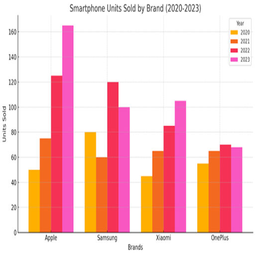
Graph Description
Annual smartphone sales (in millions) for Apple, Samsung, Xiaomi and OnePlus from 2020 to 2023.
Preparation Notes
- Title: Smartphone Sales 2020–2023
- X-Axis: Years | Y-Axis: Sales (in millions)
- Highest: Apple in 2023 (~160M)
- Lowest: OnePlus throughout (~60–70M)
- Trend: Apple and Xiaomi increasing, Samsung fluctuating, OnePlus stable
Model Answer
The bar graph illustrates annual smartphone sales, comparing four major brands between 2020 and 2023. It is evident that Apple experienced a steady rise, peaking at around 160 million in 2023. Xiaomi also grew significantly, while Samsung’s sales showed slight fluctuations. OnePlus maintained consistent but lower sales throughout the period. Overall, the graph highlights a growing preference for Apple and Xiaomi devices over time.
Sample 2: Average Monthly Rainfall in Cities
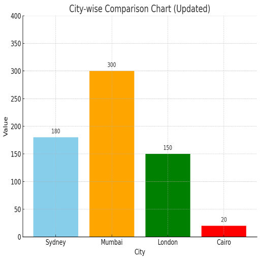
Graph Description
Average monthly rainfall (in mm) in four cities: London, Mumbai, Cairo and Sydney.
Preparation Notes
- Title: Average Rainfall by City
- X-Axis: Cities | Y-Axis: Rainfall (mm)
- Highest: Mumbai (~300mm)
- Lowest: Cairo (~20mm)
- Trend: Major variation across cities
Model Answer
The bar graph compares the average monthly rainfall in four cities: London, Mumbai, Cairo and Sydney. It is clear that Mumbai receives the highest average rainfall, while Cairo gets the least. Sydney and London fall in the mid-range, with Sydney slightly ahead of London. The disparity in rainfall is quite significant. In summary, the graph shows sharp climatic differences, especially between tropical and desert regions.
Sample 3: Internet Usage by Age Group (2022)
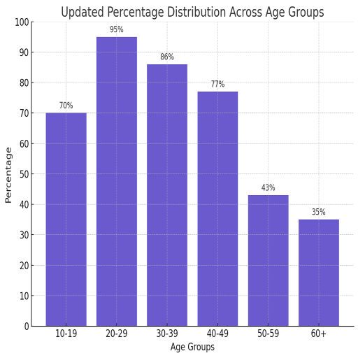
Graph Description
Percentage of daily internet users across age groups: 10–19, 20–29, 30–39, 40–49, 50–59, 60+.
Preparation Notes
- Title: Internet Usage by Age (2022)
- X-Axis: Age Groups | Y-Axis: Percentage
- Highest: 20–29 (~95%)
- Lowest: 60+ (~35%)
- Trend: Usage drops with age
Model Answer
The bar graph shows the percentage of daily internet users in different age groups in the year 2022. The highest usage was recorded among those aged 20–29, with nearly 95% using the internet daily. Usage steadily declined with age, with the 60+ group showing the lowest percentage. The 30–39 and 40–49 brackets also had strong figures, though lower than the younger groups. Overall, the data reflects a clear generational gap in internet usage habits.
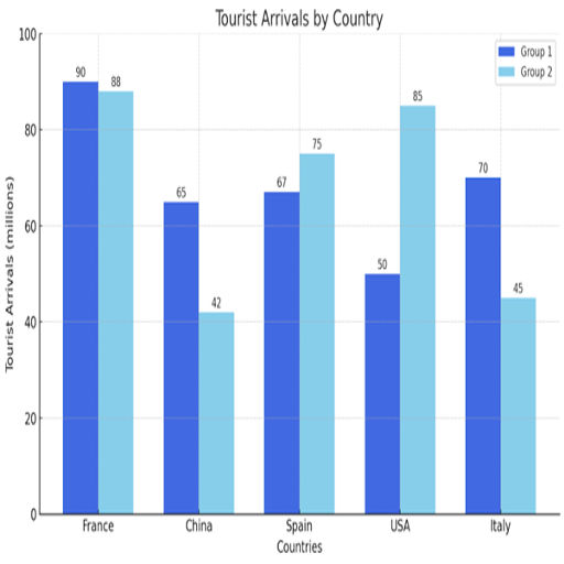
Sample 4: Tourist Arrivals in Five Countries (2021 and 2022)
Graph Description
Number of international tourists (in millions) visiting France, the USA, Spain, China and Italy in 2021 and 2022.
Preparation Notes
- Title: Tourist Arrivals by Country (2021 and 2022.)
- X-Axis: Countries | Y-Axis: Tourist arrivals
- Highest: France (~89M)
- Lowest: China (~50M)
- Trend: Europe dominant
Model Answer
The bar graph illustrates the number of international tourist arrivals in five countries in 2021 and 2022. France received the highest number of tourists on average, followed closely by Spain and the USA. Italy and China recorded comparatively lower figures, with China attracting the least. The data suggests European countries were popular destinations during that year. In conclusion, the graph underscores Europe’s continued dominance in global tourism.
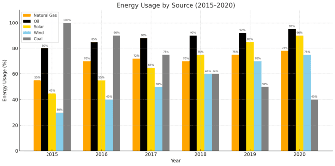
Sample 5: Energy Consumption by Source (2015–2020)
Graph Description
Energy consumption (in terawatt-hours) from five sources: coal, oil, natural gas, solar and wind, from 2015 to 2020..
Preparation Notes
- Title: Energy Consumption by Source (2015–2020)
- X-Axis: Years | Y-Axis: Energy in TWh
- Highest: Oil, followed by natural gas
- Lowest: Wind Energy
- Trend: Renewable sources growing slowly
Model Answer
The bar graph compares energy consumption from five sources between 2015 and 2020. Oil remained the leading source, with consistent usage across the years. Natural gas was the second most consumed. Renewable sources like solar and wind showed gradual growth, while coal consumption slightly declined. Overall, the graph suggests a slow but steady shift towards cleaner energy, though fossil fuels still dominate.
Common Mistakes to Avoid in Bar Graph PTE
Even with practice, small oversights in the bar graph PTE Describe Image task can cost you marks. Knowing what not to do is often as important as mastering what you should do. Here’s a rundown of candidates’ frequent mistakes—and how to sidestep them confidently.
Speaking Too Fast or Too Slow
Mistake
Rushing through the response or dragging it unnaturally.
Why It Hurts
Fast speech muddles clarity and affects pronunciation; slow speech may lead to incomplete answers.
Fix It
- Aim for a conversational pace—about 110–130 words per minute
- Practice with a timer, reading aloud sample responses
- Record yourself to catch speed fluctuations and adjust accordingly
Focusing on Every Detail
Mistake
Trying to name each value, bar or label.
Why It Hurts
This leads to robotic delivery and wasted time.
Fix It
- Prioritise trends over trivia
- Mention only the highest, lowest and notable shifts
- Use comparative language like “significantly higher than” or “relatively stable”
Poor Time Management
Mistake
Running out of time before concluding.
Why It Hurts
Ending abruptly weakens fluency and structure.
Fix It
- Stick to the 3-part format: 8 seconds intro, 20–22 seconds observations, 8–10 seconds summary
- Use signal words like “overall” to cue your wrap-up
- Rehearse pacing using a stopwatch to develop rhythm
Pronunciation Issues
Mistake
Mispronouncing numbers, years or technical terms like “category” or “percentage”.
Why It Hurts
It affects your pronunciation score and overall clarity.
Fix It
- Practice tough words aloud: “thirty”, “eighty”, “statistics”, “significant”, “between”
- Use apps or text-to-speech tools to compare your pronunciation
- Break down multi-syllable words slowly, then build fluency
Avoiding these missteps can dramatically improve how you present your bar graph PTE response, making your speech more natural, structured and score-friendly. Think of these not as warnings but as reminders to steer your focus where it truly counts.
Practical Tips to Improve Your Bar Graph Description Skills
Mastering the bar graph PTE task isn’t just about memorising templates—it’s about building habits that sharpen both clarity and confidence under pressure. To deliver confidently and score reliably, these tips cut through the noise and focus on what genuinely elevates your performance.
1. Regular Practice with Timed Exercises
Practising for the bar graph PTE task isn’t just about doing it often—it’s about doing it right. Real exam pressure comes from the clock, so building timing discipline is non-negotiable.
Practice Routine to Follow
- Daily (15 minutes): Pick one bar graph. Set a timer for 25 seconds to prepare. Speak for exactly 40 seconds. Repeat twice, each time focusing on a different graph type.
- Alternate Days: Use a mock exam interface or PTE simulator to mimic the real test environment. This builds mental conditioning for pacing and spontaneity.
- Weekly Review (30 minutes): Select five of your recordings and assess them against the scoring criteria. Focus on improvement areas, not perfection.
The key is short, consistent bursts—not cramming. Regular, time-bound exposure sharpens response time and naturalises the structure.
2. Recording and Self-Evaluation
A well-timed speech means nothing if the delivery lacks clarity or structure. Recording your responses lets you step out of the speaker’s shoes and into the listener’s.
Self-Assessment Checklist
- Did I clearly introduce the graph within 8 seconds
- Did I highlight the highest, lowest, and a notable trend?
- Was my pronunciation clear and natural?
- Did my pace remain steady without rushing or dragging?
- Did I wrap up with a proper summary?
Tools like your phone recorder or browser-based audio apps are more than enough. The goal is not to sound perfect—it’s to sound structured, fluent and easy to follow.
3. Group Practice and Feedback
PTE preparation doesn’t have to be a solo journey. Group practice brings the added benefit of live feedback—something recordings can’t offer in real time.
How to Set Up a Group Session
- Form a group of 3–5 learners with a similar proficiency level
- Assign one person to be the speaker, one to time, and others to assess using a shared rubric
- After each turn, provide 2 minutes of structured feedback: what worked, what could improve
- Rotate roles and repeat with a new bar graph
Hearing others speak helps you pick up new vocabulary, structure variations and natural intonation. More importantly, it teaches you to listen critically—an underrated skill that strengthens your own responses too.
In short, consistent exposure and targeted feedback turn this task from a challenge into a strength. The bar graph PTE task rewards preparation that’s smart, not just repetitive. Focus on improvement, not perfection—and fluency will follow.
How Fateh Education Can Help You Master PTE Bar Graphs
Conclusion
Frequently Asked Questions (FAQs)
Start with a brief introduction using the graph’s title and axes. Then highlight key trends, highest and lowest values or notable patterns. Conclude with a summarising remark. Keep it structured and natural.
You have 40 seconds to speak. Aim to use around 35–38 seconds for a well-paced, complete response without rushing or pausing excessively.
Focus on what is clear. Describe visible trends and comparative data without speculating. A structured response still earns points for fluency and pronunciation.
No. You should summarise key data points and trends rather than list every number. Quality over quantity helps maintain fluency and coherence.
Practice speaking with a timer, record yourself and review pace, tone and clarity. Use a reliable template and build vocabulary to reduce hesitation.